Prose does not belong in a cockpit
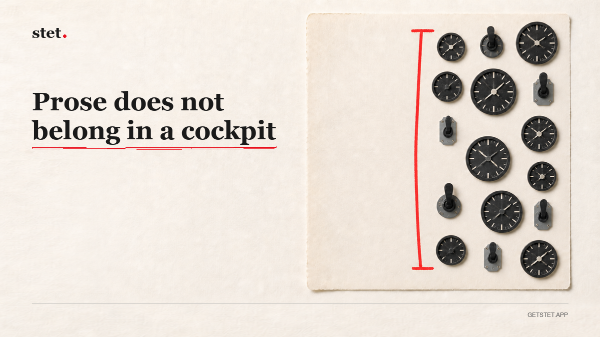
The tools for supervising agents are getting good, and they all look the same.
Panels. A file tree on the left, a diff in the middle, a session queue on the right. A kanban board of running jobs. A terminal docked at the bottom. Badges counting what is waiting for you.
For code this is correct. A developer supervising six agents needs density, and every one of those panels answers a question they are actually asking. The cockpit is not a failure of taste. It is the right instrument for the job.
Then the same shape gets pointed at prose, because prose is what the agents are producing now, and the fit is bad in a way that is easy to miss and hard to undo.
Writing needs the absence of things
This is the part that does not survive being explained in a feature comparison, so it usually gets left out.
You cannot write well in a busy room. Not because clutter is ugly. Because the sentence you are trying to find is fragile, and every element competing for your attention is a small tax on the part of your mind that was going to find it. iA Writer built an entire company on this and has been right for over a decade. Typora proved markdown could feel like paper.
Every panel you add takes something from the page. Sometimes that trade is worth it. For a tool where the deliverable is the document, it almost never is.
The tension I had to resolve
Review needs interface. It needs to show you what changed, who changed it, what it was before, and it needs to give you a way to say yes or no. That is inherently more than a blank page.
Writing needs no interface at all.
Stet has to support both, in the same window, without either one ruining the other. That constraint has driven most of the design decisions in the app.
The page is the page. White, centered, nothing in the margins by default. A proposed change appears where the change is, next to the text it touches. The detail sits in a side panel, but the panel is linked straight to that spot. It is not a pull request somewhere else reporting on the document.
Accept or reject happens in place. The history is there when you want it and gone when you do not. Git runs underneath and never shows itself, because a branch is not a thing a writer should have to think about.
The test I use: can you forget the review layer exists while you are drafting? If not, the review layer is too loud, regardless of how good it is.
Why this is a real difference and not a skin
Two products can review the same agent edits and be for different people.
A cockpit is for someone supervising work. The document is the material, the shipped thing is somewhere else, and density wins because they are managing throughput.
A page is for someone making the thing. The document is the deliverable. It has their name on it. They are not managing a queue, they are writing, and the review gate exists so they can trust the draft they are writing in.
That is a taste decision and a control decision, and I am comfortable that it makes Stet worse for the first person. It is supposed to.
I have not forgotten that first person. I am that first person. I want the denser views too, the ones that cut across many documents at once. I believe they come after. Nail creation and single-document review first, then add density.
The bet
Most tools in this space are going to keep adding panels, because the developer audience is closer, richer, and asks for them.
I think the people whose work is the words are going to want the opposite, and are going to have almost nowhere to go. A clean page, files that stay on their machine, and a gate on every change so nothing lands that they did not read.